Robert Cottingham - "Barber Shop" Watercolor Pop Art painting of red, white and blue barber shop pole


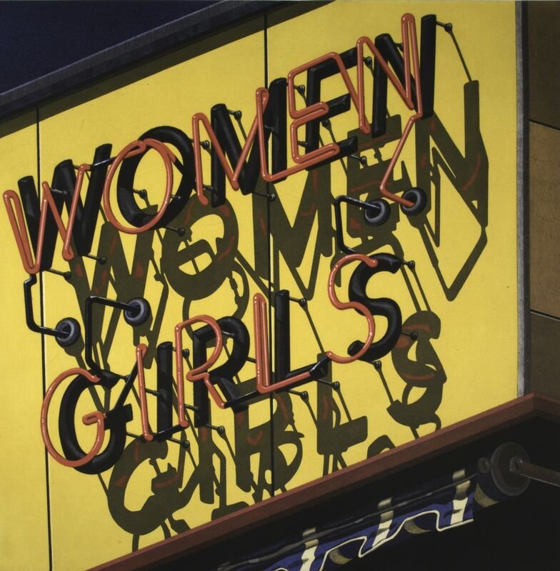
Robert Cottingham • American (B: 1935)

Barber Shop C: 1987 • Watercolor on Paper 10.5” x 10.75”

Robert Cottingham lived life at the intersection of art and commerce. Even as a Brooklyn boy he was fascinated by the flashing lights and skyscraper-tall signs of Times Square. After school he’d board the A train to the heart of Manhattan and hang out on street corners watching the river of people flow by. The signs were like the loudest voices on Times Square, blaring invitations to see things, do things and buy things. 

As Cottingham wound his way through high school and Pratt University he found himself among those who actually created the signs he’d so admired. He started as a staff artist at one of the largest advertising agencies above the maddening crowd on Madison Ave., just a few blocks from his old Times Square haunts. His advertising career ended in the sun-splashed LA offices of advertising giant Young and Rubicam.

His advertising career was short, but insinuated itself into the rest of his creative life. Once he reached the west coast It wasn’t long until he found the LA equivalent of Times Square. Nights were spent cruising past faded signs on lower Hollywood Blvd. There the young artist was captivated by the city’s bygone glories, especially the signs he found everywhere. Their outdated words and sunburned fonts appeared like the old family photos of an old hipster embarrassed when people found out about his childhood. 

(story continues below break)


INTERESTING STORIES FROM OUR SPONSORS


robert-cottingham.jpg
 

To Cottingham the exaggerated Hollywood glitz was just so much posturing to cover up an unsavory past. The Hollywood he saw put America in a whole new perspective.

He tried to leave it behind, moving to London and exploring that city from underbelly to bowler hat. But, he couldn’t make sense of it all. He never found the connection to England he’d enjoyed in America, so came home.

Returning to America, he settled in rural Connecticut far where barber poles and hand-drawn signs speckled the town. There he spent his maturity doing what he’d done since the day he walked onto Mad Men’s real world set. He told stories about America using the icons of its commercial past. Signs and outdated building facades became his painter’s palette. He found that by cropping and placing words in just the right positions he could enhance the stories told by fading storefronts. It was as if he turned headlines into high art.

Letters form words expressed in fonts. Fonts become signs. Signs become communication. In the practiced hands of Robert Cottingham, communication became art. Don Draper would have been proud.

Canton Museum of Art Permanent Collection • Purchased by the museum 2021.3


4 Ways to Sound Smart When Viewing at The Canton Museum of Art


1.
“Is he a Pop artist, or a Photorealist? That is the question. Since he elevated common signage to high art I think of him as a Pop artist. His friend Andy Warhol would agree.”

2.
“His fascination with American urban landscapes recalls the artist William Hopper. Just two lonely guys looking for friends in an age of alienation. Sigh.”

3.
“If Midge Daniels, the artist in ‘Mad Men’ who spurned Don Draper’s advances, had been a man, she would have been Robert Cottingham. His life turned out much happier.”

4.
“He often cropped words on the signs in his paintings so that they were commentary. Oh. Art. Ha.”


Cottingham Timeline. Scroll over images to see timeline.